As discussed in my last post, when colourists are grading film, they look to use colour to enhance the message the director is trying to portray. We can do the same with stills photography and use colour to enhance the message or story, we as photographers are trying to convey. We will start with the Hue or overall colour of an image and how this can be used to manipulate the mood.
Hue
 Colour Star
 Adjusting the overall hue of an image allows us to adjust the mood by using warm or cool colours. The easiest way to adjust this is using the white balance and push the photo into the cooler blues or warmer orange. Warm and cold colours are not limited to orange and blue, in fact if you look at the colour wheel to the right, the warm colours include all the colours that go clockwise from Red-Violets (Magenta) right the way around to the Yellow-Greens and the cool colours continue round the other side passing through Blue and Violet.
Giving an image a warm or cool look can effect it in several ways. Warm colours by definition create a feeling of warmth in the viewer so they are best suited to images conveying romantic, dream like or secure vision while cooler colours do the opposite and can be used to convey bleakness, insecurity and fear.
Warm colours are also considered as advancing colours, and advance towards the viewer which can be used for intimacy as they tend to pull the viewer in, while cooler receding colours can be used for opposite effect.
In addition to this different colours can have different psychological effects, for example Reds and Yellows have been shown to increase appetite (Think Maccy Dees!) but this can be effected by cultural meanings. For example in the west, Green can be considered calming because of it's association with nature (hence green rooms) but can also be associated with superstition and death in celtic tradition and even eroticism in Chinese cultures. It gets more complicated because different shades and hues of a colour can change the feeling. The full extent of colour theory is far beyond what I can do justice to in a blog post but there are a lot of resources out there and armed with this knowledge you can use colour to great effect.
While on the subject of green in particular, if you push the skin tones into the green you run the risk of making the subject looking ill or nauseated.
 xewz
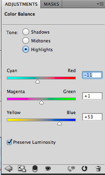
xewz Back to Photoshop, you can adjust the colours of an image using curves, which give you a lot of control but are trickier to get started with. So the easiest way to get started or save time is to add a Color Balance adjustment layer. When working with colours the Color Balance tool makes it easy to adjust the hue separately for the shadows, mid-tones or highlights.
As a general rule of thumb, you want to keep your shadows clean and adjust the highlights and mid-tones when colour grading.
In the photo below, I am using the receding property of cool colours to emphasise Sophie's isolation and loneliness by pushing the highlights and mid-tones towards the blue hues. When pushing colour around you need to watch skin tones. While you can get away with a colour cast on the skin, it is more difficult to pull off as it needs to remain relative to the rest of the image, so the brain still interprets the skin correctly.
When we were doing the shoot for this photo, we used a gold reflector as a fill light. This additional warmth has allowed me to push the mid-tones (where Sophie's skin tones reside) much further than I would usually be able to. Despite this, Sophie's skin tones are still warm. This warmth additionally contrasts the blue and you can use contrast like this to create tension in the image.
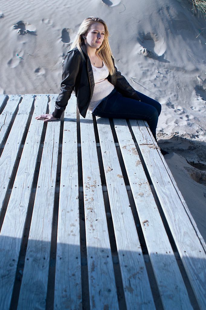 Sitting on the decking #1
 You can see the original warmer image here to contrast.
In the next post, I will look at how Saturation and Exposure both effect mood, before going on to how we can use these techniques to change the time of day of an image.