Continuing my series on Colour Grading Photos, this week we are looking at how both Saturation and Exposure can effect mood. In this series we are taking inspiration from the techniques used by colourists in film/TV to use colour to effect mood, time of day or create a stylised shot.Please note: we are not aiming for perfect colour reproduction here, we are in the realms of creative photography and so there is no right or wrong here it is purely down to what you want to achieve as an artist.
You have probably noticed that when you add contrast to an image in post (be it in Photoshop, Aperture or Lightroom) you will see an increase in Saturation. This is not just a pixel thing, away from the computer the same is true of how we perceive the sun. At sunrise and sunset the sun produces a direction light with strong contrast that increases the saturation, making the environment more vibrant. The opposite being true of cloudy days, when the light is soft with less contrast, resulting in low saturation. Our brains adjust what we see for us and often these visual cues may be barely noticeable but sub-consciously these cues are affecting our mood.
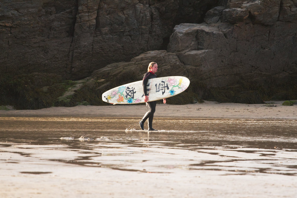
Take the two images below, both are straight from camera with only the saturation adjusted. The first image should leave you feeling colder than the second warmer, happier image.
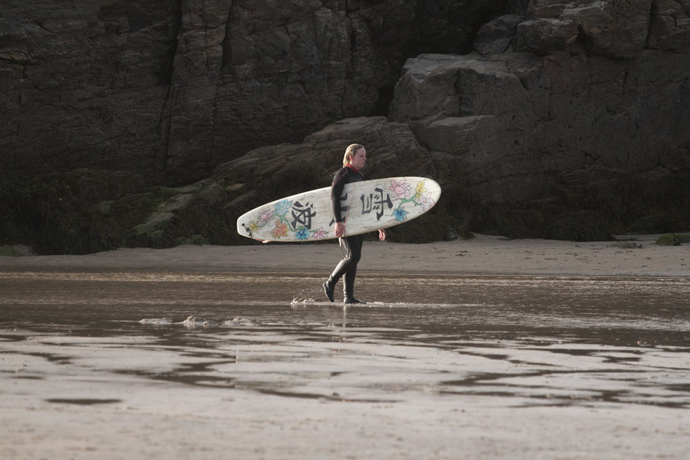 Surfer, Desaturated
 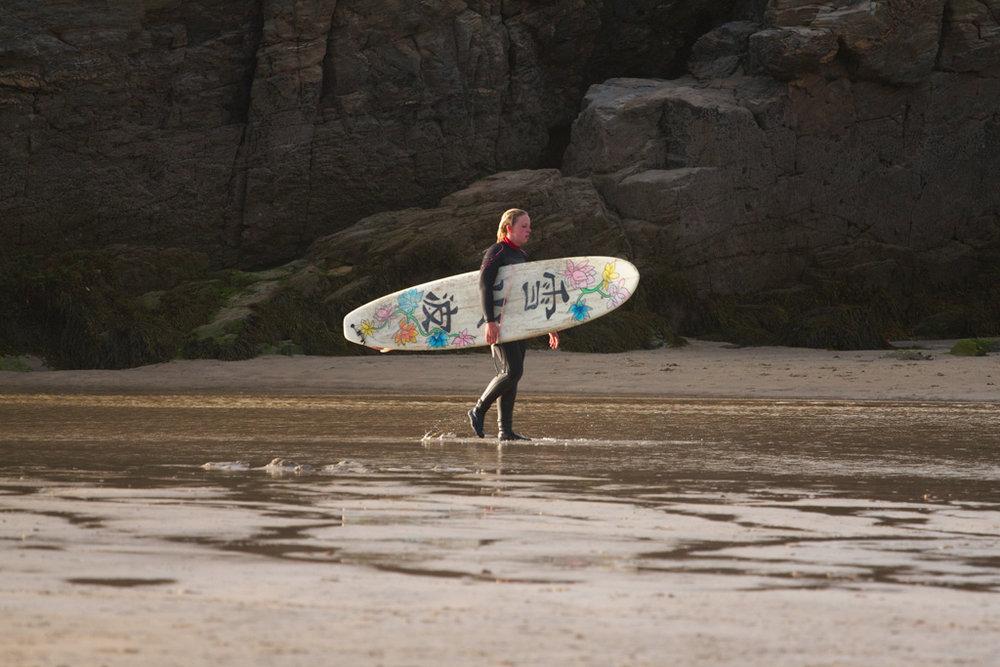 Surfer, Saturated
 Exposure can also be used to manipulate the mood, again playing on our psychology (and probably a little, our universal fear of the dark). Darker Low key shots can emphasise mystery and the unknown whereas lighter high key shots can suggest excitement or energy. Low key and high key exposure is best done in camera but we can push the values a little in post to help covey our message.
You can easily adjust the exposure with an exposure slider but this will effect your image globally (all the highlights, mid tones and shadows at once). I personally like to use the curves is this situation, but you can use whatever you prefer. If we want to increase the exposure I like to do target the mid-tones and highlights, without washing out the shadows too much. However when reducing the exposure I like to limit this to the mid-tones, not to darken the shadows or highlights too much.
So using the RGB or luminance curve, we can easily adjust these. Photoshop gives us some guidelines to help us locate the shadows, mid-tones and highlights (But if you want to be more precise, you will need to look at the histogram beneath the curve to find these).
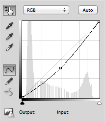 Curves, for Low Key
 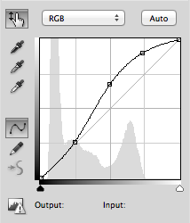 Curves, for High Key
 And so, remaining with our surfer (despite her looking exhausted), we can push the exposure up creating more energy.
 Surfer, Increased Exposure
 Or, pull the exposure down to create more mystery
 Surfer, Decreased Exposure
 So bringing it all together and going back to our image of Sophie from last week. We can now add these saturation and exposure techniques to the hue adjustments we covered last week.
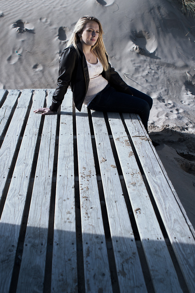 Sitting on the decking #1 (Chill)
 As a closing tip. Don't be afraid to push these hue, saturation and exposure values further than you would otherwise be comfortable, you can always knock them back using the opacity slider, but by being bold with your adjustments you can emphasise the effect, getting a better impression of the affect, then dial it down to taste.
Next week I will be covering how we can use some of these techniques to change the time of day.